
Caring Hands Homecare Services: A Logo That Feels Like Care at Home
A redesigned logo and identity for Caring Hands Homecare Services, a homecare provider looking after older people in their own homes.
- Client
- Caring Hands Homecare Services
- Year
- 2026
- Service
- Branding & Graphic Design
- Platform
- Logo & brand identity
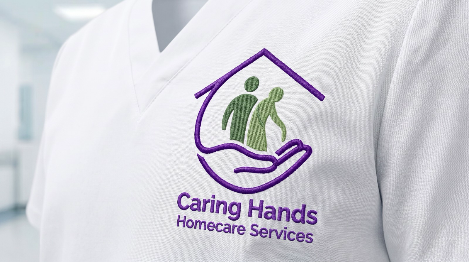
A calmer, more trustworthy identity that reads as care at home at a glance, from an embroidered uniform to a phone screen
01The Challenge
Understanding the business need
Families have to trust a homecare provider before they ever meet a carer. Caring Hands' original logo had the right ideas, a home, a caring hand and an older couple, but they were drawn as separate pieces in four competing colours, with heavy capitals crowding the badge. It was hard to read on a phone and could not be embroidered or printed small without losing detail.
02Our Solution
What we built
We kept the three ideas and redrew them as one mark. A single purple line forms the roof and flows into an open hand that holds the household; inside it, a carer stands beside an older person with a walking aid, in two calm sage tones. The name became a confident title-case wordmark with a lighter descriptor, and the palette was reduced to purple and sage so the identity looks the same on letterheads, uniforms and screens.
How the work came together
01 / 06
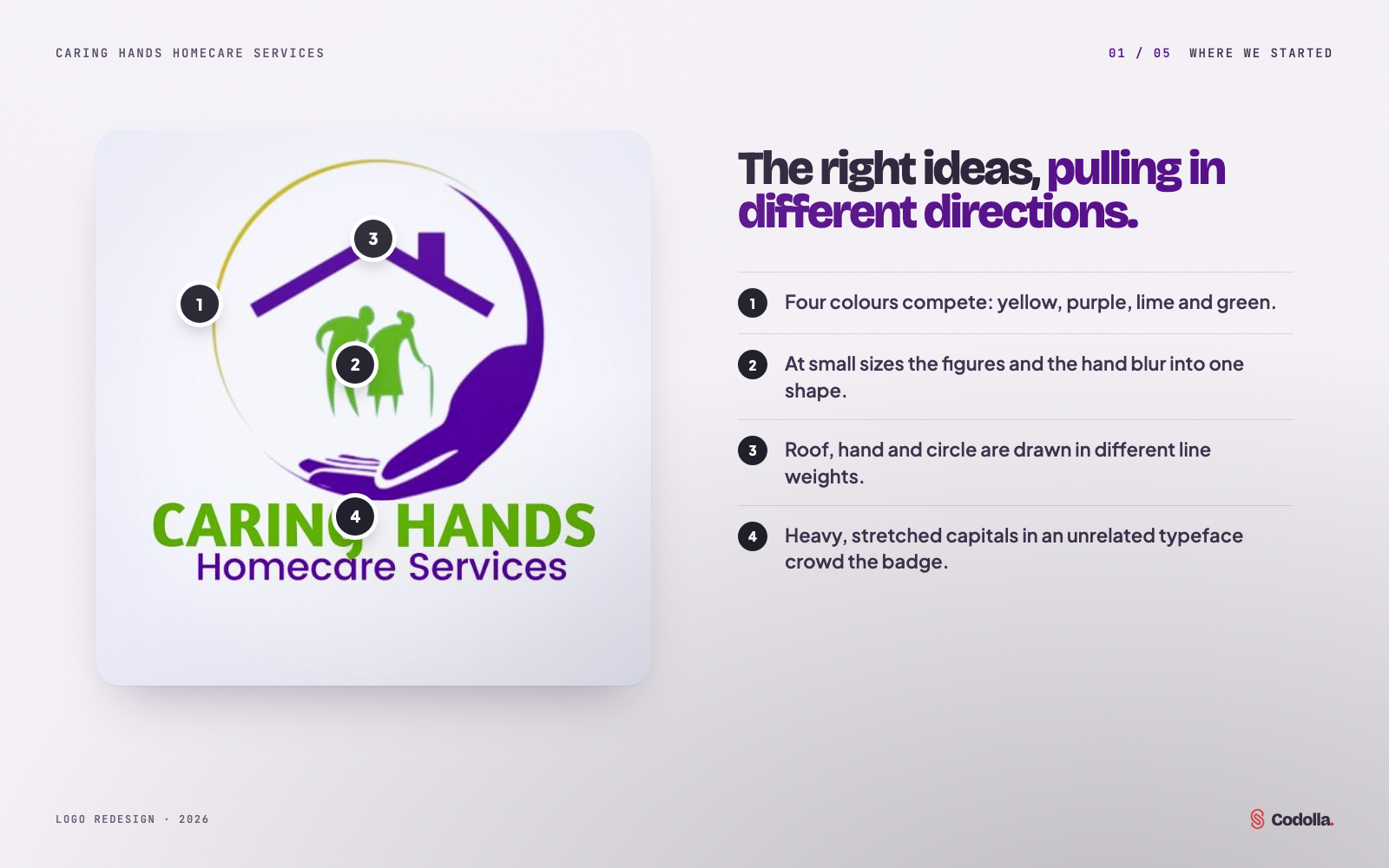
Where we started
The original badge carried the right ideas but spread them across four colours, three drawing styles and two unrelated typefaces. At small sizes the hand, the figures and the circle blurred into one shape.
02 / 06
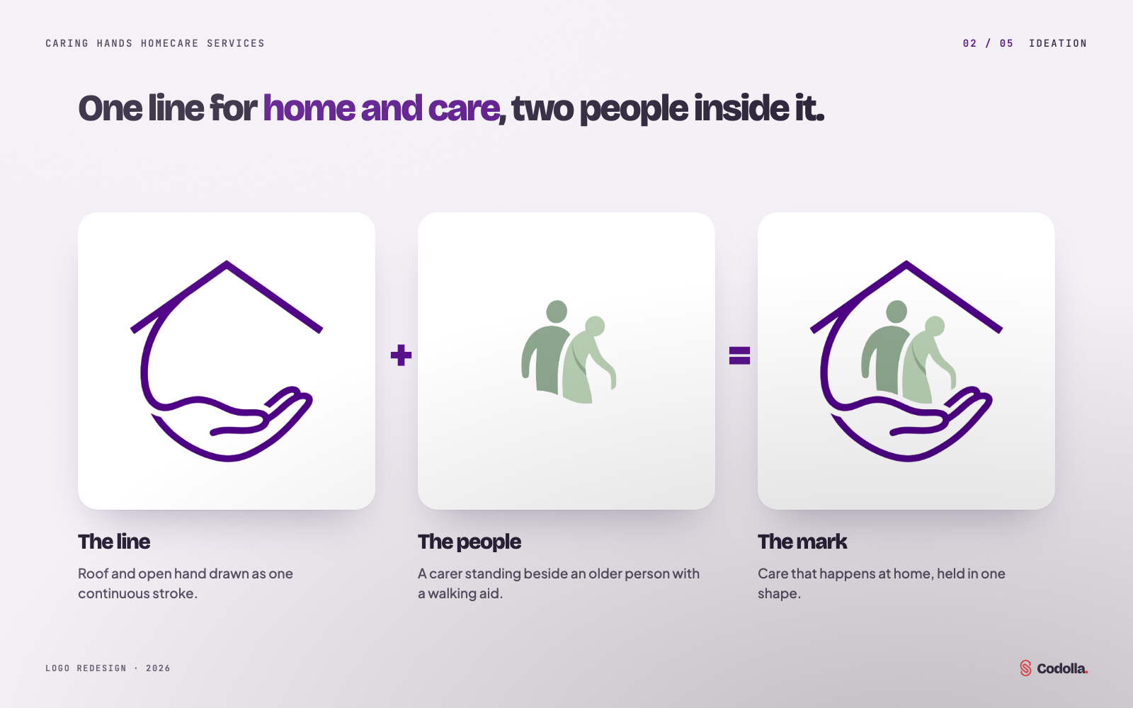
Ideation: one line, two people
We looked for a single gesture that could hold everything. Drawing the roof and the open hand as one continuous line gave us the home and the care in one stroke; the carer and the older person sit inside it, together, rather than floating on top.
03 / 06
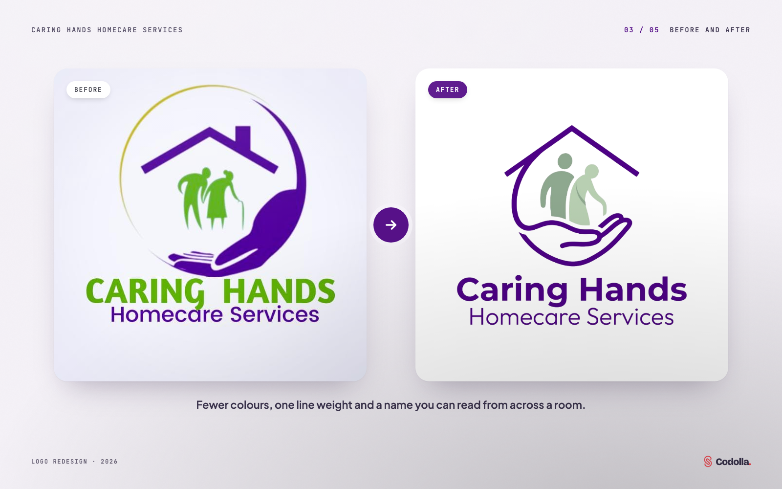
Before and after
The same story, told more clearly: fewer colours, one line weight and a name you can read from across a room.
04 / 06
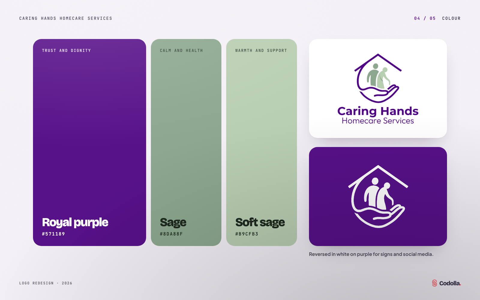
A calmer palette
Royal purple carries trust and dignity; two sage greens bring calm and health without the glare of the original lime. The mark also works reversed in white on purple.
05 / 06
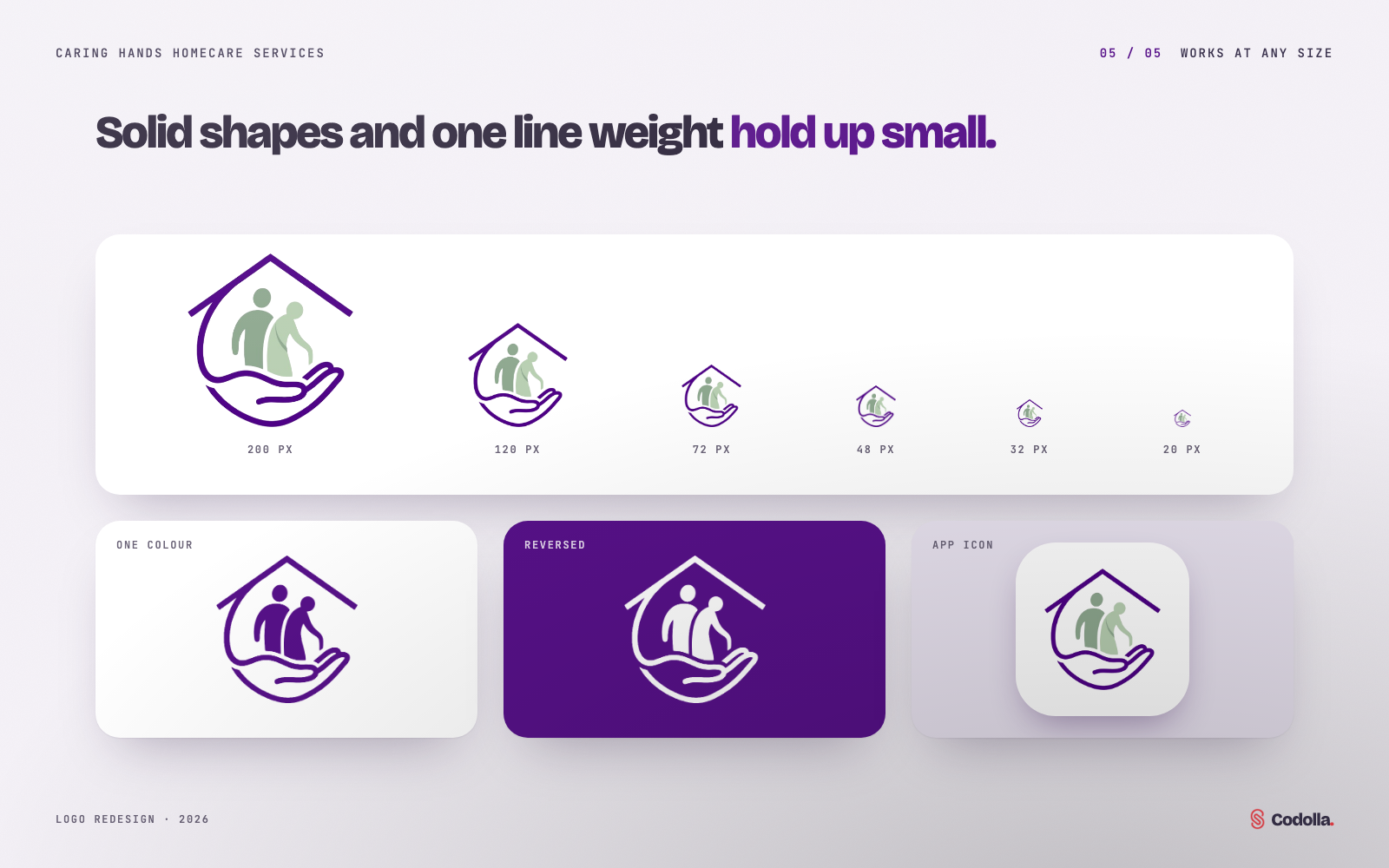
Works at any size
Solid shapes and a single line weight keep the mark legible from a sign down to a 20-pixel icon, in one colour for stamps and forms, or as an app icon.
06 / 06
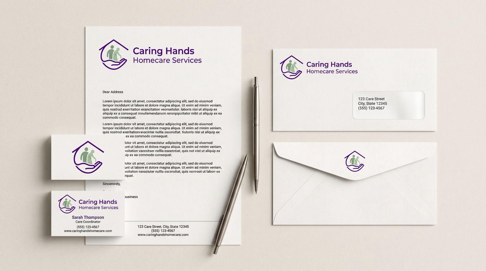
In use
Letterhead, envelopes and business cards share the same mark, colours and spacing, so every touchpoint feels like the same organisation.
Inside Caring Hands Homecare Services
- 01Redesigned logo mark
- 02Wordmark and logo lockup
- 03Purple and sage colour palette
- 04One-colour and reversed versions
- 05Letterhead, envelopes and business cards
- 06Uniform embroidery design
Next case study
Ghana Institute of Horticulturists Logo
Proposed institutional logo
Need a similar solution for your business?
Tell us what you want to improve and we will recommend the most practical next step.