
Ghana Institute of Horticulturists: A Simpler, Stronger Identity for a Professional Body
A proposed new corporate logo for the Ghana Institute of Horticulturists, presented to the Institute's Board with a full case for adoption and a phased rollout plan.
- Client
- Ghana Institute of Horticulturists (GhIH)
- Year
- 2026
- Service
- Branding & Graphic Design
- Platform
- Logo & board proposal
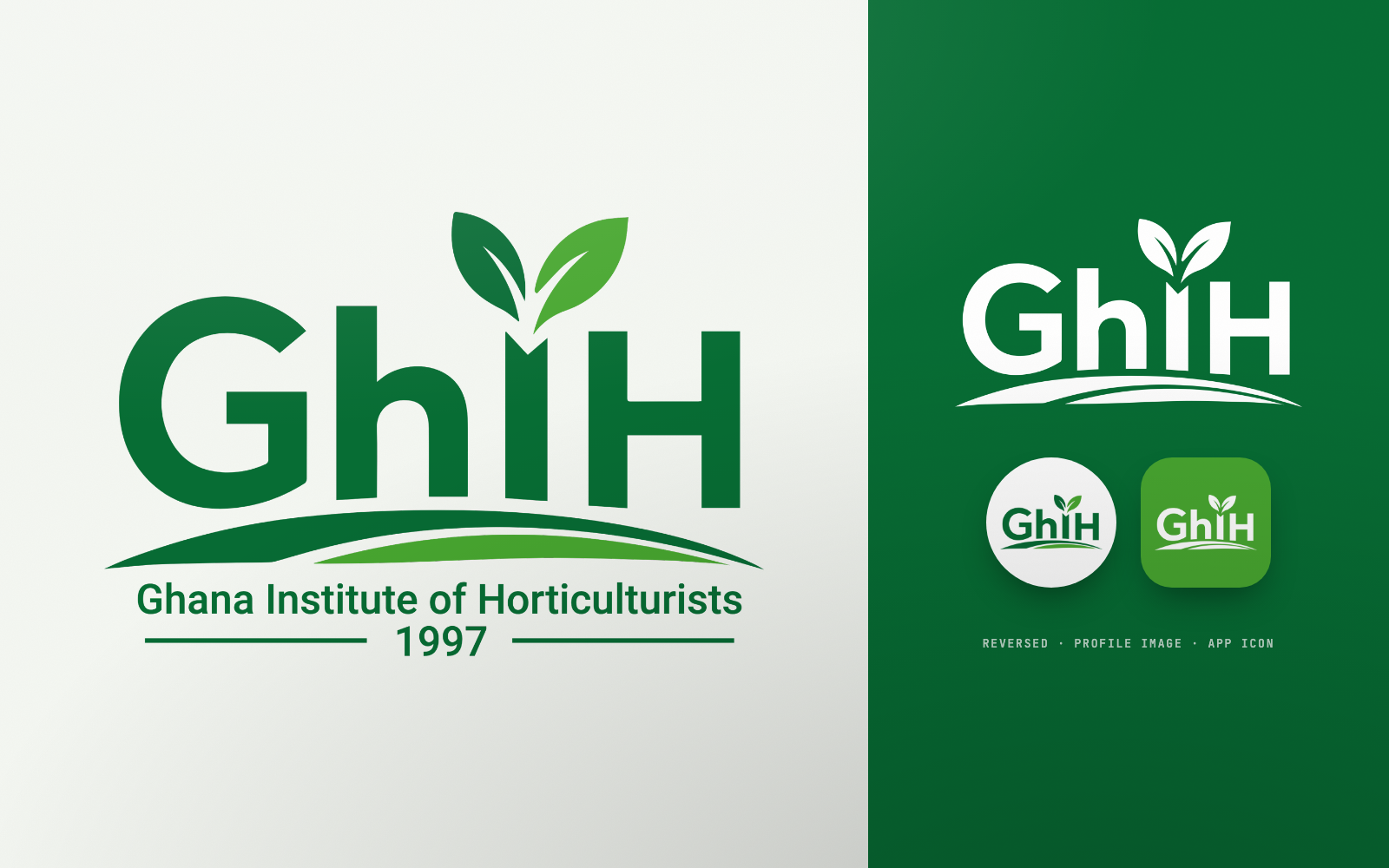
A simpler, stronger and more versatile identity that keeps the Institute's name, acronym, greens and plant symbolism, and works from a signboard to a lapel pin
01The Challenge
Understanding the business need
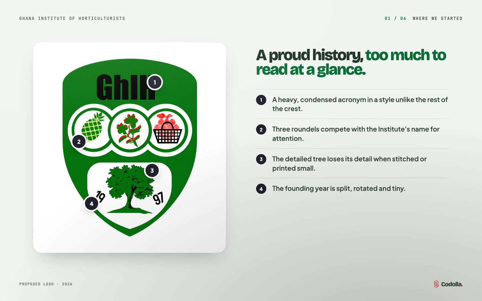
The Institute's crest carries real history: the GhIH acronym, three roundels of crops and flowers, a tree and the founding year. But its detailed shield, several illustration styles and small internal features made it hard to reproduce. On embroidered shirts, caps, badges, stamps and social-media profile images, the details disappeared and the Institute's name competed with the pictures.
02Our Solution
What we built
We put the GhIH acronym at the centre, in broad letters that stitch and print cleanly, and kept the plant symbolism in two simple leaves rising from the I, above curved lines for cultivated land. The palette narrows to two greens. Because a professional body changes its logo by decision, we also wrote the case for the Board: a side-by-side comparison, the meaning of each element, risks and mitigations, conditions before rollout and a phased implementation plan.
How the work came together
01 / 06
Where we started
The current crest has served the Institute well and carries recognisable horticultural and historical elements. But it has many separate symbols competing for attention, and its fine details are lost in embroidery, engraving and small print.
02 / 06
Ideation: lead with the acronym
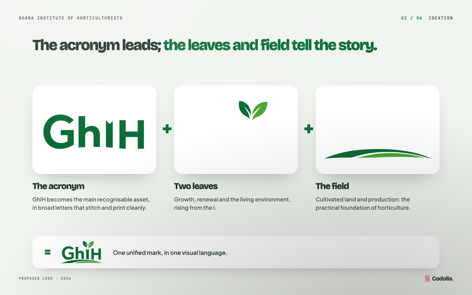
The Institute is known as GhIH, so the acronym became the main recognisable asset. Two leaves rising from the I carry growth and renewal; the curved field lines stand for cultivated land and production.
03 / 06
Current and proposed
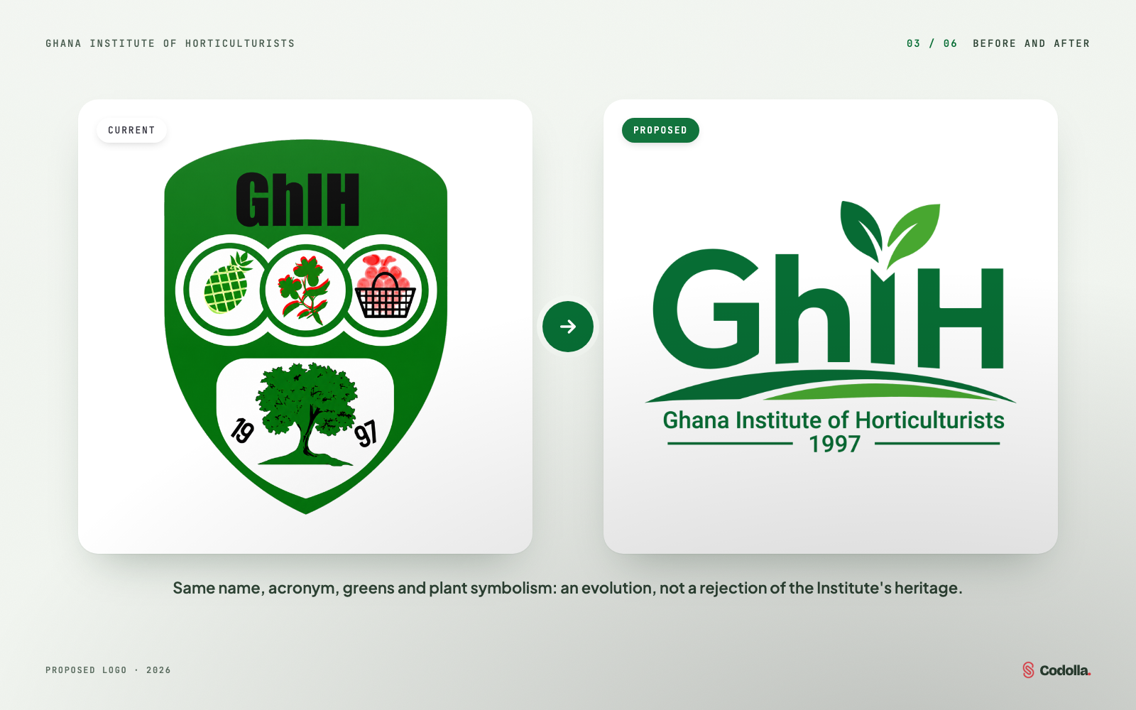
The proposal keeps the name, the acronym, the green identity and the plant symbolism: an evolution of the brand rather than a rejection of its heritage.
04 / 06
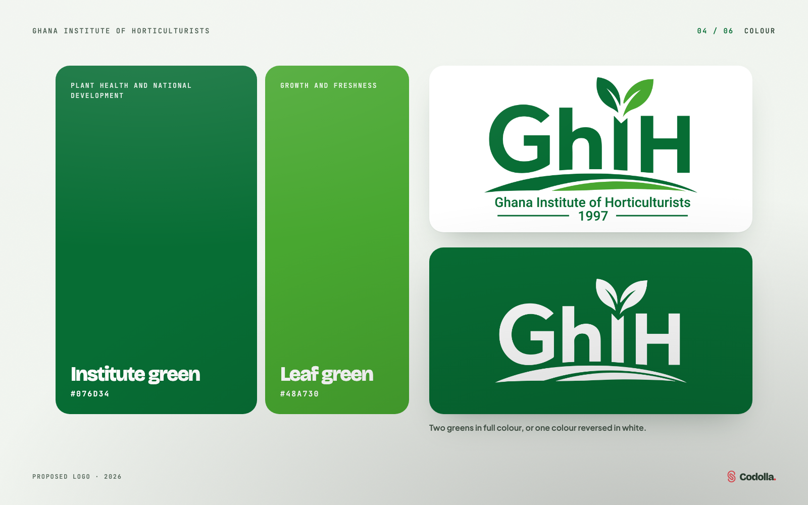
Two greens
A deep Institute green for the letters and field, and a fresh leaf green for growth. The mark also works in one colour and reversed in white.
05 / 06
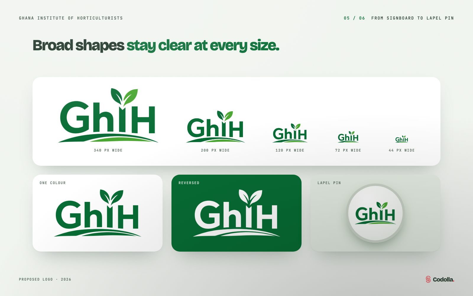
From signboard to lapel pin
Broad lettering and simple shapes keep the logo identifiable at small sizes, on a single colour, reversed out of green or as a lapel pin.
06 / 06
Making the case to the Board
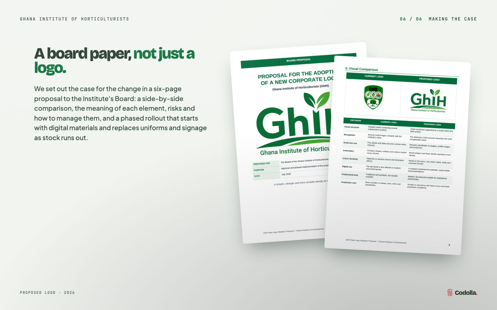
We presented the change as a six-page board paper: purpose, recommendation, a criterion-by-criterion comparison, the meaning of each element, risks and mitigations, conditions before rollout, a phased plan and a draft resolution.
Inside Ghana Institute of Horticulturists Logo
- 01Proposed logo and wordmark
- 02Element meanings: acronym, leaves, field
- 03Two-green colour palette
- 04One-colour and reversed versions
- 05Six-page board proposal
- 06Phased rollout plan
Next case study
GHIH Web App
Membership platform
Need a similar solution for your business?
Tell us what you want to improve and we will recommend the most practical next step.